I know you are busy…and so am I. So here goes…
I was speaking to a potential client that asked me why her website wasn’t converting. Let me start by saying that I am soooo tempted to put her website link in this article. But for ethical reasons, I won’t.
However, I can say that her website was and still is horrendous to look at. I can guarantee you that her website has been the butt of many jokes and although she has won more than one award for her book content. Her website does not reflect the nature of the content in her book. On top of that, the website that she has up doesn’t appeal to her target audience. Which I realized quite quickly that she hasn’t identified.
Fact is that I am going to tell you everything that I told her about her website that she didn’t implement. A year later, she still has the same website. No book sales. No new business. No coaching clients. Nothing.
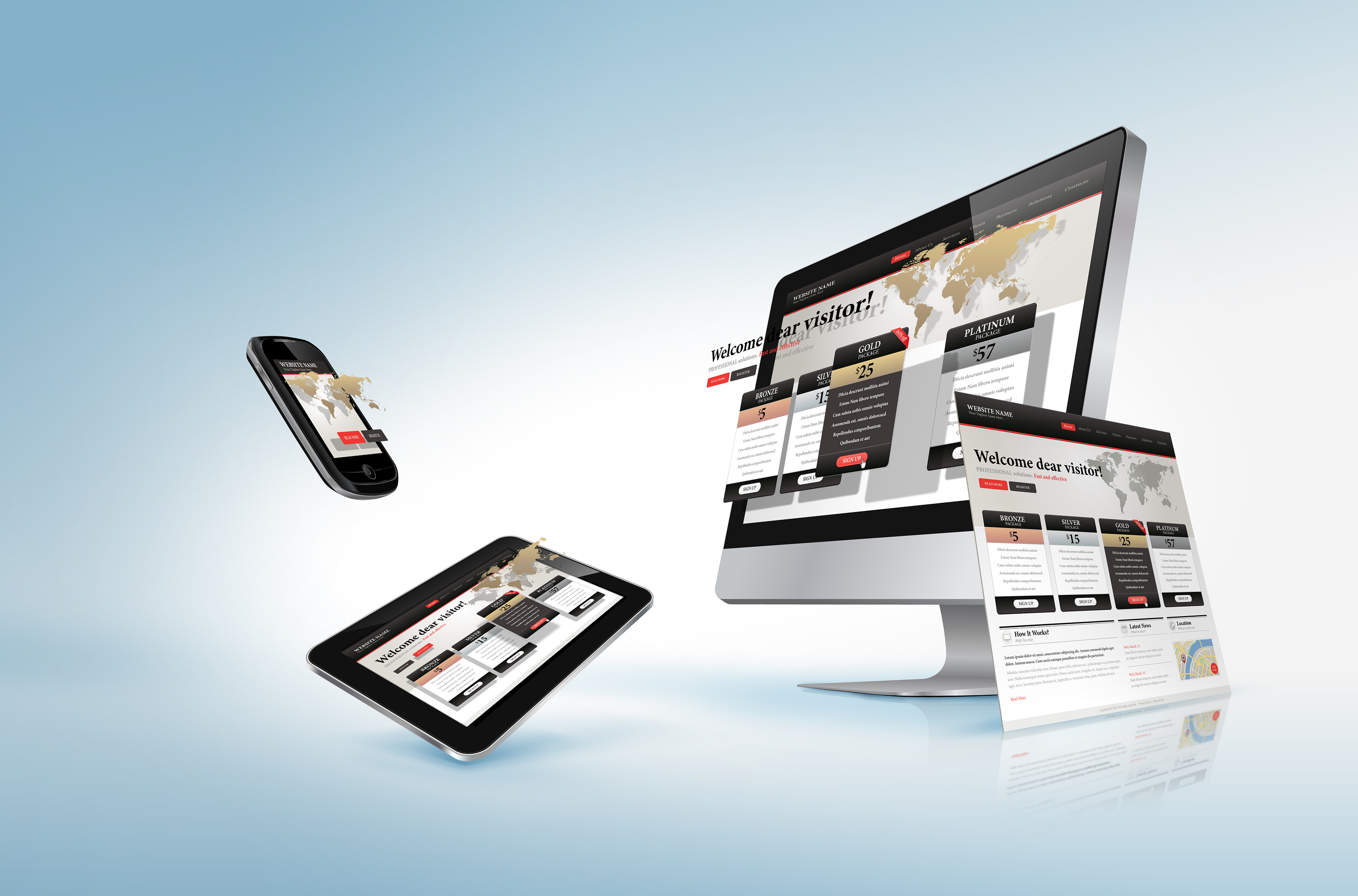
Color
From a pure marketing standpoint, color choice means something to your brand. The color you choose has to be something that customers easily connect with you, your product, or service.
In the example above, she selected a dull pinkish, mauve, lavender, grayish…..something. Don’t underestimate how powerful the use of color is on your website.
ColorHexa.com has great tools for color selection and scheme choices.
Title
The title of your website must be threaded throughout it. The above website simply had ‘Website’ no matter what she posted. The title introduces the reader or potential visitor to the website and/or gives them some idea about what they’re reading.
Every web creation platform is different so you have to make sure to pay attention to the little things like updating generic titles, etc. on web templates and platforms. It can hurt your SEO (Search Engine Optimization). Plus, to be honest, it just looks tacky.
Search
Search bars within your website is totally optional. However, if you choose to use a search bar, by God let me be able to find it quickly.
Hiding your search bar at the bottom of the page is annoying. More importantly, if I come to the website and the search bar isn’t at the top of the page, more than likely I am going to leave immediately. Why? Because it lets me know that the website designer did not consider the visitor at all.
What if I read something that I want to come back to later? Are you telling me that I have to scroll all the way to the bottom to find the search bar to start perusing your website to find what I am looking for? Just writing it made me tired.
Lesson here? Make sure your search bar shows up on each page and is near the navigation of the page.
Ad Placement
So ads are another optional aspect of a website. But the same rules apply as the search bar. Put the ads where visitors can see them…quickly. You don’t have the attention of the visitor forever. As a matter of fact, Hubspot conducted a survey that implied, 55% of visitors stay on your website for 15 seconds or less!
Again, you don’t have all day to convey your message.
Appearance
Lastly, what I am going to say is difficult for some to hear, but it has to be said. If you don’t have the money or the time to invest in a professional photo shoot. Please use stock images or no image of yourself at all.
Camera phones are awesome for taking pictures for the purpose of social media engagement. However, pulling a shirt out of your closet and then standing in the mirror to snap a photo with a low-quality camera phone is not the ticket. Don’t do it.
If your photo is on the front page of your website, it had better be a premium high-quality photo or I can tell you for certain and 2xs for sure that you are dragging your brand down and losing potential customers that will not take you or your product seriously.
Regardless of how great you or your product are.
Final Thoughts
Your website is one of the jewels of your business. Keep it super simple. Don’t add any extra creative elements to your website if you are doing it yourself and you don’t have proper training.
Use a company like Wix instead of going the DIY route if you need more functionality to your site to make it effective. Your website represents you. So don’t cut corners to the extent that you damage your brand instead of building it.
All the best!